Haiku Deck to Teach Visual Literacy

In many cases, Kindergarten is where we learn how to read. How do we teach young students to read? If you're not working with young students, here is a pretty common conversation that happens in almost every Kindergarten classroom at the beginning of the school year:
T: Can you read this book to me?
S: I can't read read!
T: Yes, you can, you can look at the pictures and tell me what is happening.
Before we even learn how to interpret letters into words, we are already interpreting images and making meaning. It is only logical then, that this is how we begin to teach students how to read.
Images and media fill our lives every day. From what makes us stop to watch something when we're flipping through channels, to how we choose which links to click on our Facebook feed, or even how we decide whether or not to walk into a shop. All these things are influenced by visual literacy, the way we interpret pictures, images, and objects around us. As defined by Stokes (2002), visual literacy is not just about consumption, but also the ability to "generate images for communicating ideas and concepts". In our daily lives we both interpret and generate images in the hopes of communicating through a wide variety of possible media.
Choices...Choices...
I began thinking about how I ask my students to use a variety of tools to create images on a daily basis. But am I teaching them how to make choices about the message they want to send? Am I teaching them how to make choices when using images? The answer is, if I was, I wasn't doing it consciously!
Luckily for me, I had a lesson planned for the first grade classes which involves the use of Hakiu Deck. Haiku Deck makes use of Creative Commons images to create simple and clean presentations.
First grade was covering a science unit on the different states of matter, solid, liquid and gas, with a larger focus on liquids and solids. The goal of this lesson was to allow students to demonstrate their learning by creating a short slideshow of examples of these three states of matter. Seems simple enough right? It then occurred to me that I was about to ask 6 year-olds to try and make appropriate image choices out of all the images that would be produced each time they did a search! I realized that we needed to have a discussion before they were set free to search Creative Commons images on their own.
Wood is a Solid
I introduced this lesson by showing my own Haiku Deck presentation first. I made four slides, all with the same text:
Wood is a solid.
On each slide the key search word was "wood". Here is the slideshow:
Wood is a solid. - Created with Haiku Deck, presentation software that inspires
I tried to put myself in a 6 year-old's shoes and think about what would make me choose a picture, especially if I had suddenly gotten distracted by all the cool images that just appeared before me. I could imagine many students choosing the images of flowers and butterflies that appeared so I put one of those into a slide. I could also imaging some students choosing the image of the tiger lying on pieces of wood simply because there's a tiger in it, so that image went in. Finally, I chose two images that could both portray the meaning in the text accurately, but perhaps drew on different emotions.
I presented my own slideshow to all six first grade classes at my school and as predicted, there were students who chose the flower photo and the tiger photo giving the reason that they thought these images were "pretty" or "cool". Many were able to justify the tiger photo by saying that there was still wood in the picture. As the discussion went on, each class came to similar conclusions:
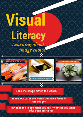
The picture should match the words
The main focus of the picture should be the main focus of the words (what's the biggest thing in the photo or what takes up most of the photo?)
Think about what you want your audience to feel when you choose a photo
Everyone decided that there were two possible options, the second photo and the last photo. We talked about the emotions that the two photos drew upon and why they thought one might be better than the other. There were some interesting answers:
I think [photo 4] is better because there is more wood in it than the other one.
The second one makes me feel happy becuse it's like a park and the trees are alive. The last one the trees are cut down.
I like the last one because I think it's scary and I want my audience to be scared! It's cool!
For watever reason, we all decided that one or the other would be an appropriate choice. I made this poster (using Canva.com) to go on a display board outside my computer lab. These ended up being the three main questions that we all decided we should ask ourselves before we chose a photo.

Student Examples:
Ben P(Barrus) - Created with Haiku Deck, presentation software that inspires
Isabella(Morris) - Created with Haiku Deck, presentation software that inspires
Milton (Walter) - Created with Haiku Deck, presentation software that inspires
